Your Quest for Pixel-Perfect Flutter UIs is Slowing You Down. Here’s How to Fix It.
Fix your Flutter UI bottleneck: Ship beautiful, consistent apps way faster with these tips.


Is ‘pixel-perfect’ the hill your Flutter project dies on? You adopted Flutter for speed, for cross-platform efficiency. Yet, UI development feels like trench warfare. Endless tweaks. Inconsistent components. Spiraling bug counts tied to visual regressions. The promise of velocity clashes with the reality of the backlog. You're not alone. Many teams find UI is where Flutter's rapid development promise hits a wall. But the problem isn't Flutter. It's likely your approach.
Industry data whispers a harsh truth: a significant chunk of development time is sunk into UI implementation and refinement. While exact figures vary, studies like those referenced by Pendo suggest UI/UX issues can consume upwards of 50% of engineering resources in rework cycles. That’s capacity you don’t have. That’s market opportunity slipping away. Forget pixel-perfect for a moment. Let's talk pixel-profitable. Let's talk velocity.
This isn't about choosing between speed and quality. It's about achieving both through smarter architecture, disciplined processes, and the right kind of leverage. At 1985, we've navigated these trenches with clients ranging from nimble startups to established enterprises. We've seen what works, what breaks, and what scales.
The Architecture of Speed: Beyond Widgets
Flutter’s widget system is powerful. It’s also a potential minefield for inconsistency if not governed correctly. Simply composing widgets isn't enough for complex, scalable UIs. You need structure. You need foresight.
Taming State Management for UI Consistency
State management is often debated in terms of performance. Fair enough. But its impact on UI consistency and development speed is arguably greater. Poor state management leads to unpredictable UI behavior, tangled dependencies, and nightmarish debugging sessions.
Consider a common scenario we encountered at 1985 with a Series B fintech client. Their app displayed complex financial data across multiple screens. Different teams used different state management approaches (Provider here, Bloc there, some homegrown solutions). The result? Inconsistent loading states, data mismatches between views, and UI bugs that only appeared under specific state combinations. It was chaos. Debugging took longer than feature development. Our solution involved standardizing on Riverpod, chosen for its compile-time safety and clear separation of concerns, coupled with strict guidelines on state scoping. This wasn't just a technical change; it was a process overhaul. The initial investment in refactoring paid off within two sprints, cutting UI-related bug reports by nearly 40%, according to their Jira metrics. Internal data from 1985’s audits shows teams adopting a single, well-understood state management pattern reduce UI defect density significantly compared to those allowing fragmented approaches.
Actionable Takeaway: Mandate a single state management library across your project. Document clear patterns for its use, especially regarding state scope (global vs. feature vs. widget) and handling asynchronous operations impacting the UI. Tool: Create a State Management Decision Record outlining why a specific library was chosen and its core usage patterns.

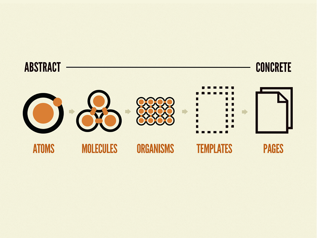
The Unsung Hero: Atomic Design & Strict Component Libraries
“Pixel-perfect” shouldn't mean designers nitpicking individual padding values in code reviews. It should mean components inherently render correctly because they are built from controlled, reusable primitives. This is the essence of Atomic Design principles applied to Flutter.
A health tech client approached 1985 struggling with brand consistency across their growing suite of Flutter apps. Their core issue wasn't a lack of design specs; it was the lack of enforcement. Developers rebuilt similar components repeatedly, introducing subtle variations. We helped them implement a strictly versioned, shared Flutter UI component library built on atomic principles (atoms, molecules, organisms). Each component had defined properties, adhered to the design system's spacing and typography rules, and was rigorously tested. A key finding from a study on design systems by Nielsen Norman Group highlights that mature design systems can speed up product development significantly, though quantifying the exact percentage varies widely by implementation (NN/g - Design Systems 101). Our client saw a tangible impact: new feature UI development time decreased, and visual regression bugs plummeted. The design team could now focus on UX flows, not pixel policing.
Actionable Takeaway: Invest in a robust, version-controlled component library based on atomic design principles. Enforce its usage rigorously. Disallow one-off custom widgets where a library component exists or should be created. Tool: Implement automated linters or custom analysis rules to flag deviations from the component library.
Process Bottlenecks: Your Standups Won't Save You
Great architecture means little if your development process actively hinders UI implementation. Agile isn't broken, but your interpretation of it might be, especially concerning the design-development handoff.
Killing the Handoff Waterfall: Continuous Design-Dev Integration
The traditional “design completes, then dev builds” model is a recipe for UI disaster in Flutter. Static mockups rarely capture all states, interactions, and edge cases. Developers are left guessing, leading to rework. This friction point is costly. Research, including insights mirrored in reports like the Stripe Developer Coefficient, consistently points to inefficient collaboration and communication as major drains on developer productivity - While older, the core findings on productivity drains still remain relevant).
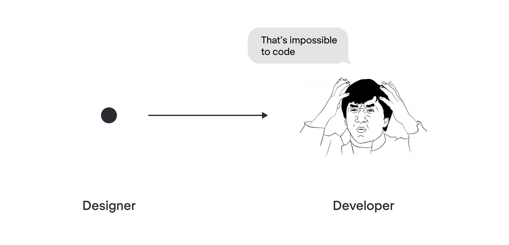
We worked with an e-commerce platform where the design team delivered high-fidelity Figma files, but developer interpretations varied wildly. The feedback loop was slow – build, review, fix, repeat. 1985 instituted mandatory, brief (15-20 min) design-dev syncs before coding started for any UI-heavy feature. Designers walked through prototypes, developers asked clarifying questions about states and interactions upfront. We also championed using interactive prototypes over static images whenever possible. This simple process change dramatically reduced the “interpretation gap.” It shifted UI feedback to the left, making it cheaper and faster to address.
Actionable Takeaway: Replace the traditional handoff with continuous integration. Mandate pre-development design-dev syncs for UI features. Use interactive prototypes. Embed designers partially within sprint teams if possible. Tool: Shared Design-Dev Feature Checklist ensuring all states (loading, error, empty, populated), interactions, and responsive behaviors are discussed before coding.
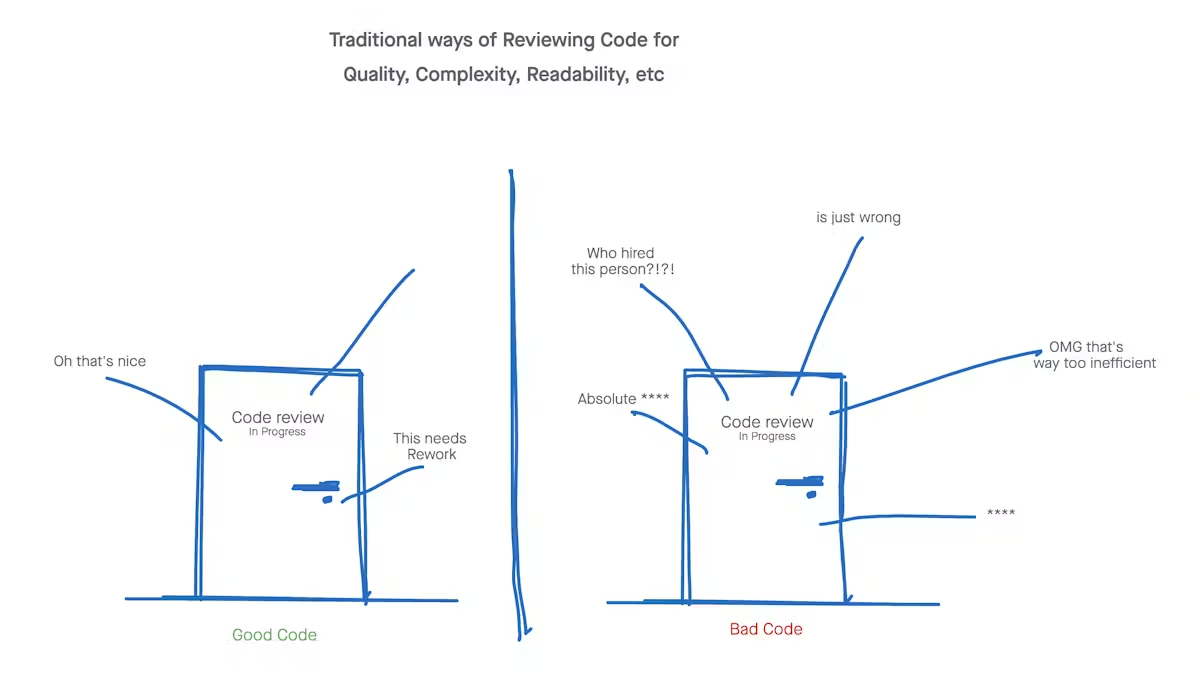
Beyond Linting: Automated Visual Regression Testing
Manual UI testing is slow, tedious, and error-prone. Your QA team can't catch every pixel shift across dozens of screens and device sizes. You need automation specifically for the visual layer.
A SaaS client of 1985 faced constant visual regressions. A seemingly minor change in a shared component would subtly break layouts on unrelated screens, often caught only pre-release (or worse, by users). Standard unit and integration tests missed these issues. We introduced automated visual regression testing using a framework integrated into their CI/CD pipeline. The first run established baseline screenshots. Subsequent builds compared new screenshots against the baseline, flagging any visual discrepancies for review. While setting this up requires initial effort, the long-term payoff is huge. It acts as a safety net, allowing faster refactoring and component updates with confidence. Studies on test automation, like those discussed by Capgemini, emphasize the ROI through reduced manual effort and faster feedback cycles (Capgemini - Continuous Testing Report - General testing ROI principles apply). The client reported a significant drop in late-stage UI bug discoveries and increased developer confidence.
Actionable Takeaway: Implement automated visual regression testing in your CI/CD pipeline. Start with critical user flows and core components. Treat visual regressions as seriously as functional bugs. Tool: Explore frameworks like flutter_test's golden file testing or third-party visual testing platforms.The Outsourcing Paradox: Faster UIs, Higher Stakes?
Outsourcing Flutter UI development can inject speed and expertise. It can also amplify existing problems if not managed correctly. Handing off UI work without the right guardrails is asking for trouble.
Governance is Non-Negotiable
The biggest failure mode we see in outsourced UI development? Lack of clear standards and governance. Assuming an external team will magically intuit your design language or adhere to unwritten architectural rules is naive.
We inherited a project for a logistics company where their previous vendor had delivered a Flutter app riddled with inconsistencies. Different padding, clashing font styles, components that looked similar but behaved differently. Why? No enforced component library, no shared state management patterns, no automated visual testing. It was faster initially, perhaps, but the technical debt accrued was massive. When 1985 took over, our first step wasn't coding; it was establishing governance: defining the component library usage, standardizing state management, and setting up CI checks. This upfront investment is crucial. As a Manufacturing CTO told us after a similar rescue operation: “Outsourcing failed miserably until we treated the external team not as code monkeys, but as extensions of our own, subject to the same standards and reviews.”
Actionable Takeaway: If outsourcing UI, ensure the partner understands and commits to your established architecture, component library, state management patterns, and testing strategies before writing a line of code. Demand transparency in their process. Tool: Outsourcing UI Development Checklist covering standards, communication protocols, review processes, and acceptance criteria.
Comparing Build Strategies: Time & Cost Implications
Choosing how to build your UI has significant implications. Here’s a simplified comparison focusing on UI development speed and consistency:
| Approach | Typical Speed (Initial) | Typical Speed (Scale) | Consistency Risk | Cost Profile (Initial) | Cost Profile (Long-Term) | Governance Need |
|---|---|---|---|---|---|---|
| In-House Team | Moderate | Moderate-High | Moderate | High (Salaries) | Moderate (Maintenance) | High |
| Freelancers | Fast (Small tasks) | Slow | Very High | Low-Moderate | High (Rework, Mgmt) | Very High |
| Generic Agency | Moderate-Fast | Moderate | High | Moderate | Moderate-High (Debt) | High |
| Specialized Agency (1985) | Fast | High | Low | Moderate-High | Moderate (Efficiency) | Collaborative |
The key takeaway? Initial speed doesn't guarantee long-term velocity. Consistency, driven by strong architecture and process (whether in-house or via a specialized partner like 1985), is what prevents UI development from becoming a bottleneck as the application scales. Successful outsourcing hinges on strategic alignment and robust governance, not just cost arbitrage.
Actionable Takeaway: Evaluate build strategies not just on upfront cost or perceived speed, but on the partner's ability to enforce standards that ensure long-term UI consistency and maintainability. Ask potential partners how they guarantee adherence to design systems and architectural patterns.
Measuring What Matters: From Pixels to Performance
Stop measuring UI success solely by designer sign-off. Start measuring its impact on development velocity and user experience.
Metrics for UI Development Health
“Pixel-perfect” is subjective. Velocity and stability are not. Track these:
- UI Bug Density: Number of UI-specific bugs reported per feature or per sprint. Trend down.
- Component Reusability Rate: Percentage of UI built using the central component library vs. custom one-offs. Trend up.
- Visual Regression Failures: Number of automated visual test failures caught in CI. Stable or decreasing.
- Design-Dev Cycle Time: Time from feature design finalization to UI implementation completion (including fixes). Trend down.
Internal data from 1985’s project retrospectives consistently shows a correlation between high component reusability rates and lower UI bug densities. Teams rigorously enforcing library use simply encounter fewer visual inconsistencies and regressions.
Actionable Takeaway: Implement tracking for these UI health metrics. Discuss them in sprint retrospectives. Make UI quality a shared responsibility, not just a QA or design problem. Tool: Add UI Health Metrics section to your team's dashboard.
Ship Faster, Not Sloppier
Building pixel-perfect Flutter UIs doesn't have to be a drag on your timeline. It requires moving beyond the surface-level appeal of widgets and embracing disciplined architecture, integrated processes, and rigorous automation. It demands a shift from chasing individual pixel alignment to building systemic consistency.
The strategies outlined here – taming state management, enforcing atomic design via component libraries, integrating design and development, automating visual testing, and establishing strong governance (especially when outsourcing) – aren't quick hacks. They are investments in sustainable velocity.
At 1985, we embed these principles into every Flutter project. We believe speed without quality creates technical debt that eventually grinds development to a halt.
Is your current Flutter UI process built for speed and scale? If your team or development partner struggles with UI consistency, velocity, or managing visual regressions, it might be time for a different conversation.
Ask your team (or partner) these 3 questions:
- How do we enforce our design system and component library usage?
- What's our strategy for automated visual regression testing?
- How do we measure the cycle time and bug density specifically for UI development?
If the answers aren't clear and confident, ping 1985. Let's talk about building Flutter UIs that are not just pixel-perfect, but predictably fast and reliably robust.


